Friday, April 5, 2019

Project 11 PreWork - Inspiring Magazine Designs

While looking through magazine designs, I was inspired by many designs that had a retro feel to them, and had a creative approach to fashion, design, and aesthetic. 

Covers: 
♔ Vogue ~ Paris ÉditionVintage Paris Vogue - I love the simplicity of the logo.48. Clash

Ads: 
#pool #skateboarding1960s Advertising - Magazine Ad - Cannon Royal Family (USA) | Flickr - Photo Sharing!

Spreads: 
Kelly Lam: "Different media techniques including both wet and dry are enforced. Builds quite a vivid image that compliments the text. Dark and sullen colours connote the serious tone of the issue."Amazing Magazine Layout Design Idea (25)


Thursday, April 4, 2019

Project 10- Two Portraits

Fine Art Portraits:

I took this picture of my little cousin in Lan Su. I'm recreating
a picture of her smelling this type of flower when she was
younger. This photo portrays the coming of spring and
a sort of youthful wonderment of nature and of beauty
I took this picture at my first concert.
I was right up front and I got a first hand
view of how passionate and how much
character this singer had. So that's what this
photo portrays.
Commercial Portraits:

I took the first photo of a protester at the environmental walkout and the second of my friend in nature. They both are trying to "sell" the idea of saving the planet, you can see this based on the sign and of the words "Go Green" on her face as well as the green motif in the photo. 

Thursday, March 21, 2019

Project 10 Pre-work Fine Art vs Commercial Portraits

Commercial:                                                       Fine Art:
Alia Shawkat - Natalia Mantini

The lighting is very warm and she is in a relaxed position which
gives of the vibe of leisure and being carefree.


Alia Shawkat - JUCO


In the commercial one, she's looking straight on,
and you can see her freckles really well which
catches your attention, she's also
wearing a button up shirt which is seen
as masculine which plays off of her
gender neutrality vibe in order to sell that style of
clothes. 

Wednesday, March 13, 2019

Project 10 - pre work(commercial portraits)

Commercial Portraits:
A Picture taken of somebody in order to sell or promote an idea or product.

lelaid: “Aline Weber by Giampaolo Sgura for Vogue Brasil, September 2014 ”
Giampaolo Sgura for Vogue Brasil 
Photographed by JUCO, Marique Schimmel wears a Blumarine dress with fur trim
JUCO for Vogue Taiwan
Both of these artists are trying to sell clothes because they are working for a fashion company. They both seem to be selling a retro aesthetic. Brasil's seems to be more grunge, and Taiwan's seems to be more classy. The models are both beautiful and appear confident, which will make Vogue's consumers want to buy the clothes that they're wearing. 

Project 10- Pre work(Fine Art Portraits)

Fine Art Portraits:
A picture of a person with the intention to convey a feeling, mood, or story.


Gemmy Woud-Binnendijk
I like the expressions on their faces and the fact that this
photo is supposed to emulate an old painting that
you might find in a museum.

BW Child Photography Winners
"Unity" by Paulina Duczman
I think this portrait portrays the ambience of being a child. She seems carefree, relaxed, and peaceful, given the fact that she's fallen asleep on a ladder. As well as the fact that being asleep is a very vulnerable state to be in. 

Tuesday, March 12, 2019

Project 9 - Surrealism

I created this picture by taking a picture of my cats eyes in the sunlight so the color really popped, and added saturation and then pasted them on a picture of my friend, this is surrealism because Bella doesn't actually have cat eyes that I know of.

I created this picture by taking a close up of a fish tank and then a picture of my little cousin and put her in the fish tank, this is surrealism because you don't usually find small children in small homes of aquatic animals.

Sunday, March 10, 2019

Project 9 Pre-Work

Surrealism - An artistic style whose purpose is to release the creative potential of the subconscious mind
Image result for frida kahlo surrealism paintings
"The Love Embrace of the Universe, the Earth (Mexico), Myself, Diego, and Señor Xolotl" - Frida Kahlo
Image result for pablo picasso surrealism
"Girl Before A Mirror" - Pablo Picasso 
Huseyin Sahin uses nature, landscapes, and buildings in a way that couldn't be possible in real life. Such as an ocean, clock tower, or old building in the middle of a cliff. As well as the ocean water floating away from the cliff when there's nothing supporting it.
Phoebe Rudomino shows surrealism by depicting a woman in a room in an otherwise normal room, save for the fact that it's filled with water that the woman is submerged in. 

Thursday, March 7, 2019

Tuesday, February 12, 2019

Project 8-pre work

Polaroid Lifts and Transfers:
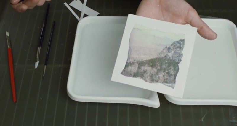
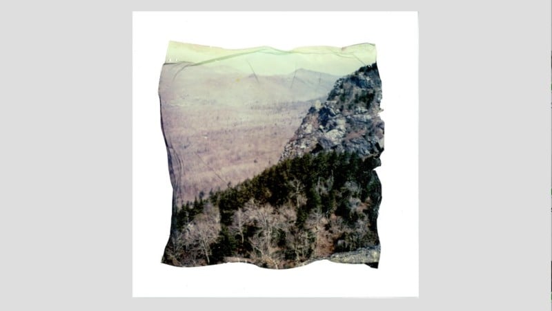
An emulsion lift (or emulsion transfer) is when the emulsion layer is removed from a sheet of instant film and then transferred to a different surface. Just cut the edges off your Polaroid print, submerge it in water, and then use a brush to gently move water up underneath the emulsion. This will slowly-but-surely separate the emulsion from the plastic, at which point you can slide a piece of paper underneath it and brush the emulsion down onto its new surface.
//petapixel.com/2017/02/01/emulsion-lift-transfer-image-polaroid-paper/

Cyanotype: The Cyanotype, which is also known as ferroprussiate or blueprint was invented by Sir John Herschel in 1842, when he discovered that ferric (iron) salts could be reduced to a ferrous state by light and then combined with other salts to create a blue-and-white image. The cyanotype emulsion is sensitive to ultraviolet light. Therefore either sunlight or another UV light source must be used for exposure. 
Blue Sunprints CyanotypeRelated image
https://www.freestylephoto.biz/alternative-process/cyanotype

Monday, February 11, 2019

Wednesday, January 16, 2019

Semester 1 Reflection

In semester 1 one of Digital Photography I have definitely learned some necessary photography tips and tricks. By learning about all the different structural aspects, I feel like it helps you get across a more emotional aspect. When you make the photo look aesthetically pleasing, you can then put your own touch on it to create a mood.
I really appreciated the color unit because i feel like I learned about created different vibes with different colors, and how to use different colors together. 
I feel like the last project was my favorite though because we could look at a wide range of photographers and choose one that we identify with. Then we were cut loose and allowed to do whatever we wanted with our newly learned tips and tricks. This allowed for a lot of individuality which was well represented in the class's presentations.


Tuesday, January 15, 2019

Project 6.5


We shot at the Portland waterfront. Abby took the pictures, and I put the collage together. She took multiple pictures of bridges and of roses because Portland is often described as the city of roses and the city of bridges. I tried to put all of the bridges in the center to make one long warped bridge. then I cut up portions of the sky and mixed them together. Then I cut out the roses and the portland sign and made them stand out.